
Don’t Forget to Colour Check!
Like any profession, photography can ocassionally be a little stressful, but we love what we do, so if you hear about us checking for greys, it’s more likely to do with white balance than the hairs on our heads. Where fine art photography might allow various interpretations of a scene or aesthetic freedom on the part of the photographer, our commercial work often calls for extreme accuracy in the representation of colours and tonal values, hence metering for exposures and white balance is a standard part of our shooting routine. With each lighting set up we include a shot of our trusty colour checker, placed as close to the points of focus as possible, whether that’s an illuminated model’s smiling face or a material swatch such as in the image below.

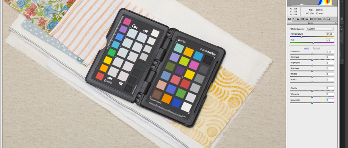
Once you’ve got a shot of your colour checker, you no longer need to worry about white balance for that lighting set up regardless of the different subjects you might put into the frame (remember to shoot in RAW for easy white balance adjustment) as you’ll be able to copy the correct white balance across to a batch of images in Lightroom, Photoshop, Capture etc. Shooting numerous products such as clothing which may vary wildy in colour, it’s easy for a camera to get tricked when setting an AUTO white balance so a client’s range of items may not be represented consistently, but a colour checker or at least grey card will eliminate this problem in post processing. The following image breaks down the features of the colour checker we use for shooting.

Below you can see some of the more useful features of the colour checker in action. By using this reference image to set your white balance and check the effect on your tonal range and principle palette of any adjustments you make in post, you can then batch process your images with this consistent set of adjustments, confident your images accurately represent your subject.


There’s a lot you can do with a colour checker (this one even comes with bundled software for setting colour profiles etc) but at the very least it’s an invaluable tool for getting a correct white balance reading and allowing quick and easy warming up and cooling down of both skin tones and more abstract scenes. Remember to use one when you’re completing commerical work and there’s less chance your client will see red and leave you feeling blue. Happy snapping.