
How to read histograms
No, a Histogram’s not some berk who rings your doorbell then recounts the rise and fall of Rome to you in song, but a feature on your digital camera or image-editing software, useful in attaining correct exposures.
The dictionary definition of a histogram is more than a little confusing, but essentially, it’s a graphical representation of the pixels exposed in your image, rating their tonal value from pure black to pure white, where black = 0 and white = 255. A higher concentration of data on the left hand side of the histogram represents a larger number of pixels with a dark tonal value – for example numerous shadows in a dimly lit room – whilst a high concentration to the right means your image is awash with light tones, such as bright sunshine streaming onto a white wall. The middle of the graph represents mid-tones exemplified by the 18% grey card reading.

A “perfect” histogram might hump evenly in the middle and only just reach both sides, signifying a large spread of even mid tones, some black and some whites, but the reality is different photographic subjects will be represented differently. The histogram below shows a shift to the right as the scene is primarily composed of light tones. It is correct, since there are very few dark tones to be represented on the left hand side.

Similarly, the below image is predominantly comprised of dark tones whose pixel data will be represented with a shift to the left on the histogram.

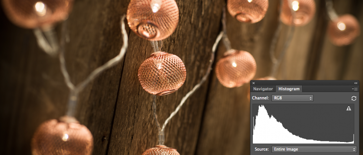
Whilst some subjects are definitely biased towards light or dark tones, many complex scenes require a more even spread. Trying to ascertain a correct exposure by squinting at an image on your camera’s tiny LCD screen might not inspire confidence in your clients, but a histogram can let you know instantly if you can dial an exposure up or down without compromising your overall shot. If you have gaps in your histogram at either end, it means you are missing pixel data for those (dark or light) tones and you can probably shift your exposure accordingly to cover a better tonal range. The histogram below has a lack of data in the whites, so you know you can dial up your exposure and reshoot to better represent the scene and shift the spread to the right. If you’ve got large gaps in the left of your scene, you may want to stop down your exposure to find true blacks as well as detail in the highlights.

If an image results in spiking at either end of the histogram, this is known as clipping. A spike out the top of the histogram suggests you may not be able to recover the pixel data for those tones, whether they are highlights or shadows. This may be something you want to then address with your exposure, or it may be an aesthetic choice you’ve made, such as in the image below. There is no highlight data in large areas of the image, but it works with the scene.

Furthermore, some scenes may be too high in contrast (too much dynamic range) for the camera to capture both highlight and shadow detail. Think of a shadowy, dimly lit room interior, with a window showing a brightly lit exterior. You won’t be able to expose these two key areas of the scene perfectly with one shot, and your histogram will likely show spikes at both ends and quite possibly clipping. This doesn’t make it incorrect, it’s just a challenging scene for the sensor to interpret. Like many things in photography, there are numerous work-arounds to attaining great results in situations such as these and we’ll cover them in future posts.
So, whilst some exposures might be deemed “wrong” for a particular scene or brief, others will be artistic choices made by you as the photographer. Whilst histograms can be a very useful tool, do not slavishly adhere to them to the detriment of your creative vision. Happy shooting!