
Product Photography for Notonthehighstreet.com, Part 1 : Food and Drink
At Photography Firm we’re proud to say we’ve been at the snapping game for the best part of 30 years now. We remember back when cameras were as big as houses and you needed horses to operate them and they only shot in sepia, and, and… well maybe not, but we’ve been doing it a while. Over the course of three decades, we’ve shot a pretty diverse array of subjects flora, fauna and inanimate, predominantly settling on the latter as we’ve become one of the country’s leading product photography studios. We’ve always shot for publications, catalogues and company websites but increasingly in the noughties and beyond we’ve serviced the exploding industry created by e commerce sites such as Amazon and Notonthehighstreet (“Not on the High Street” or NOTHS for the uninitiated). These hugely popular platforms make it possible for sellers both big and small to find great exposure, success and business reach in an increasingly globalised world.
With ever more enquiries from makers, traders, small and medium-size businesses wanting to sell alongside a string of satisfied clients we’ve already shot for, we thought we’d dedicate some space to explaining just what makes for successful product photography for Notonthehighstreet.com. The NOTHS brand generally favours clean, light, and naturally soft imagery so there’s a pleasing aesthetic consistency to their site. As with any product photography, care and attention to detail are essential no matter the subject. Keep a clean and tidy shooting area, remove unnecessary distractions and pick props and backdrops which compliment and accentuate the desirability of your main subject or brand. USE A TRIPOD and ensure your main subject has tightest focus. If you don’t have a large natural light source, use soft boxes and modifiers with strobes. For more product photography standards, have a look through our blog archive.
Over the next few posts We’ll be covering some of the key photography “genres” on NOTHS with essential tips and guidance, both gleamed from our extensive industry experience and their own market-researched photography guides.
This week, for starters (and mains… desserts….) we’ll be looking at Food and Drink. Tuck in…..
Soft natural light is most appetising when shooting food so aim for a large window, diffusing the sunlight with tracing paper or similar before it hits your subject. Aim for pleasing directional lighting so your subjects reveal their form. Ensure shadows are not distractingly long or deep and contrasty. Soft and subtle is the NOTHS way. Proper light-source diffusion and bounce-fill (use white card or foam-board) should help you achieve this. Conversely, if your lighting is too flat, a little light-flagging with black card goes a long way.


Reproduce colours authentically by white-balancing with a colour checker or grey card and select the most tip-top and well-presented items when it comes to packaging, branding etc. Where applicable, show the packaging proudly in your shots. If you’re presenting food on a plate, aim for clean, appealing arrangements – the kind of thing you might like to be served in a restaurant. Use props for context, scale and visual interest but generally ensure your main subject dominates the frame. When choosing props, tell a simple story (a knife and crackers next to the cheese you’re flogging) or reinforce the feel of your brand with carefully selected, stylistically sympathetic items and settings – If your brand wants to elicit natural, wholesome, rustic charm, GET SOME WOOD in there!! Props set a scene and help customers contextualise and understand your product but they should not distract or detract from the main attraction so don’t go overboard, especially if you’re not a natural art director.


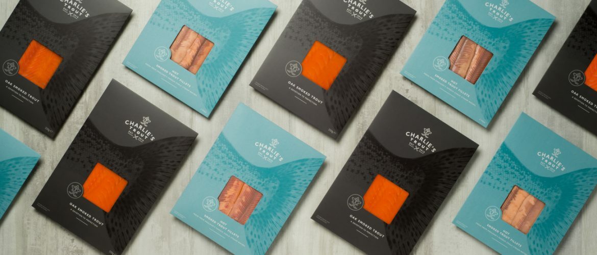
Think about the best angle to shoot from. Bottles and jars generally scream for straight-on, whilst shots involving plates, bowls and nice surfaces demand a little elevation. Flat-lay (overhead) photography is a very popular photographic trend which gives great scope for graphic compositions including several subjects. Try shooting on light, neutral looking surfaces such as marble or tiles which imply cleanliness and hygiene. If you need to display packaging to help sell the product, you might aim to keep it prominent but unobtrusive by setting towards the background and at an angle. If your packaging doesn’t actually show its contents, it goes without saying it’s best to display them together in shot.


Explore details and vary your compositions and arrangements for success. Boxes and hampers should appear in a graphic, contemporary fashion. Arrange them meticulously in shot to reinforce how carefully their contents have been selected. Ensure packaging is clearly visible and labels are facing straight to camera. Elevate the camera if necessary for visual interest and to reveal packaged contents.


Finally, show progression in your shots. Cut into details or interesting features and accentuate key features, whether that’s lettering on the packaging or frosting on a cake. Show texture and quality by getting in close. NOTHS encourage a wide selection of shots, so snap away and mix it up but try not to over-complicate your images with distracting or unnecessary additions. By all means tell a story, but make it clear to your customers who the hero is.
Thanks for reading


